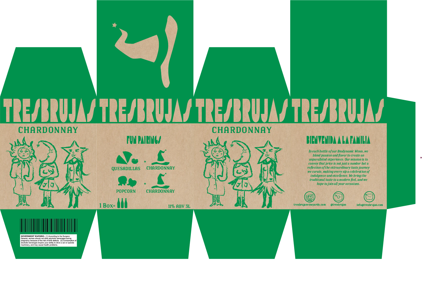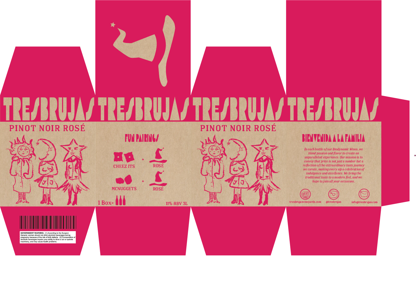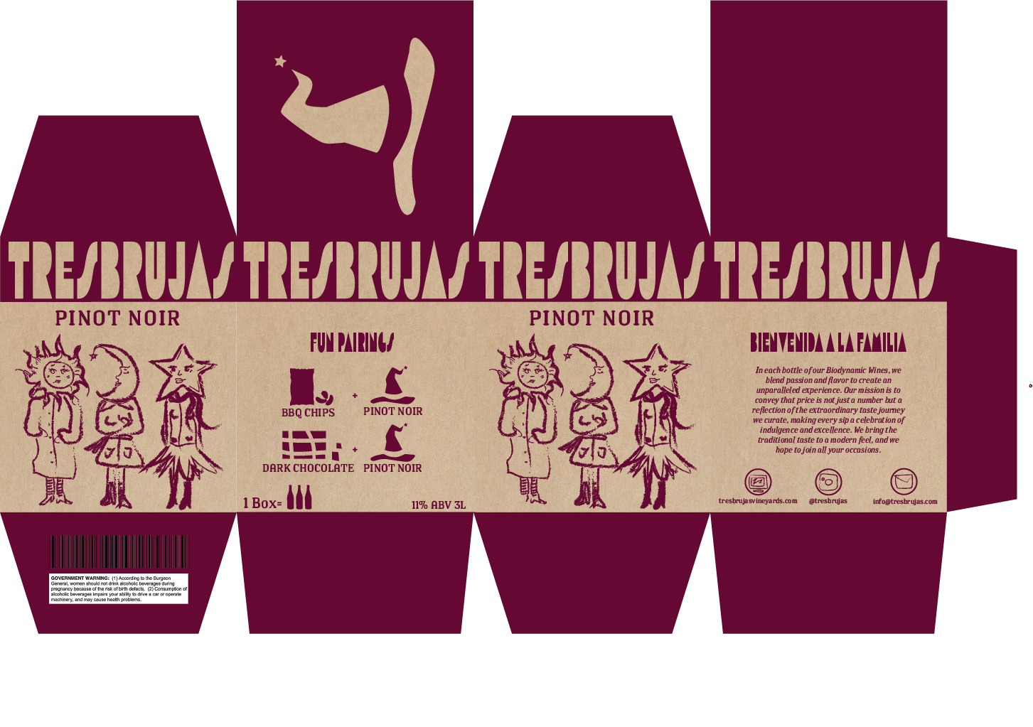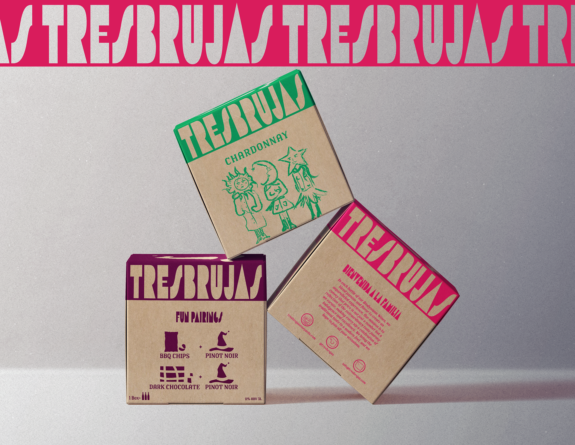
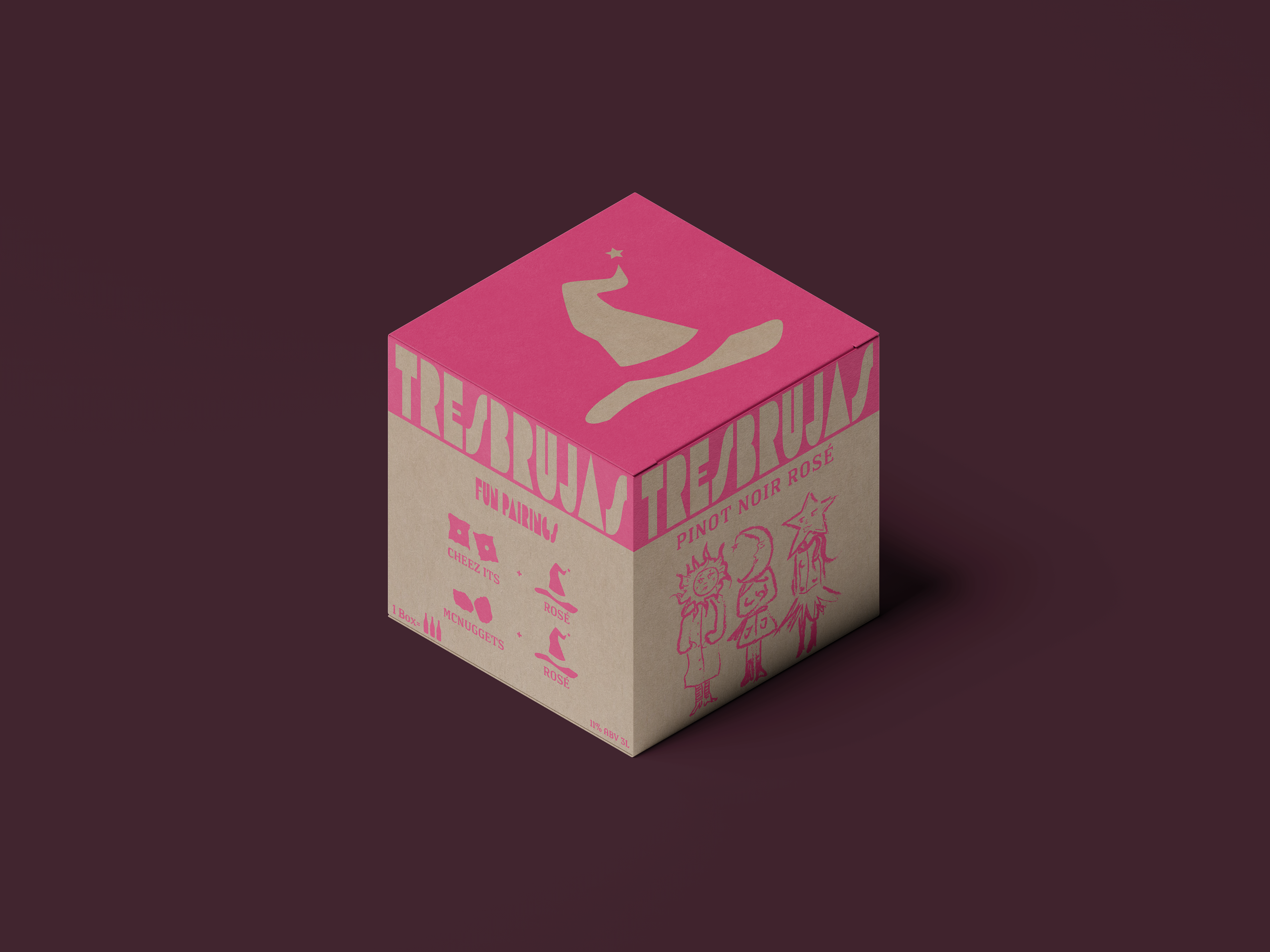
For this project, I was tasked with developing a wine brand with sustainability at its core. Every aspect of the design pays homage to Latin American culture, from the visual storytelling to the curated pairings for each wine variety. The final packaging is intended to be printed on 100% recyclable cardboard, reinforcing the brand’s commitment to eco-conscious practices.
In a market traditionally dominated by glass bottles—which are often difficult to recycle—I made a deliberate choice to design a wine box. This format not only reduces environmental impact but also aligns with the brand’s mission to offer an elevated, accessible, and responsible product.
Each box features carefully crafted food pairings tailored to its respective wine variety, adding both cultural context and functional value for the consumer. The design is vibrant, meaningful, and rooted in tradition, while also pushing forward a sustainable approach to luxury packaging.
Looking ahead, I see opportunities to further reduce the brand’s ecological footprint by exploring biodegradable inks or naturally derived pigments—ensuring that every element of the product aligns with a more mindful future in design.
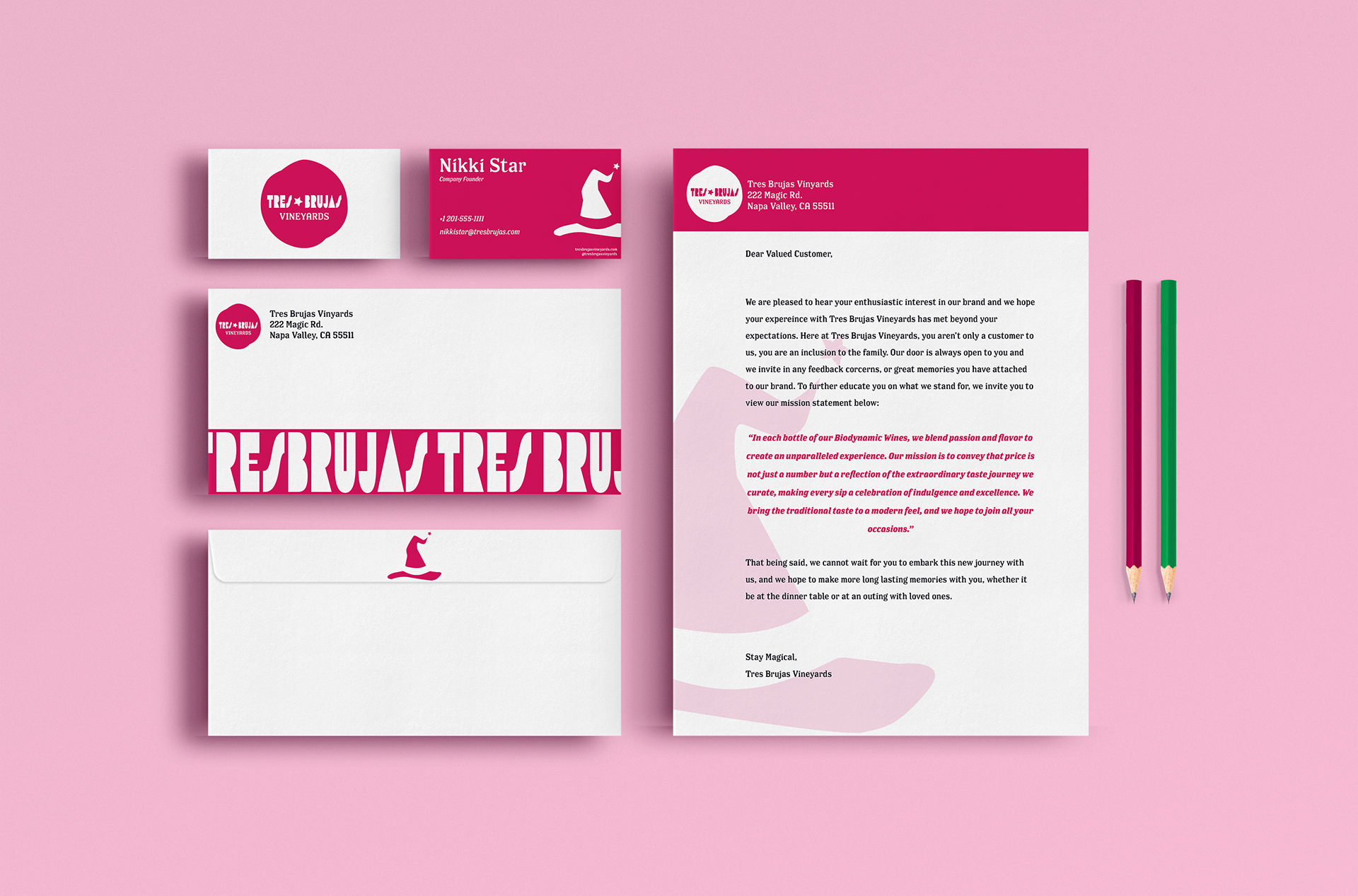
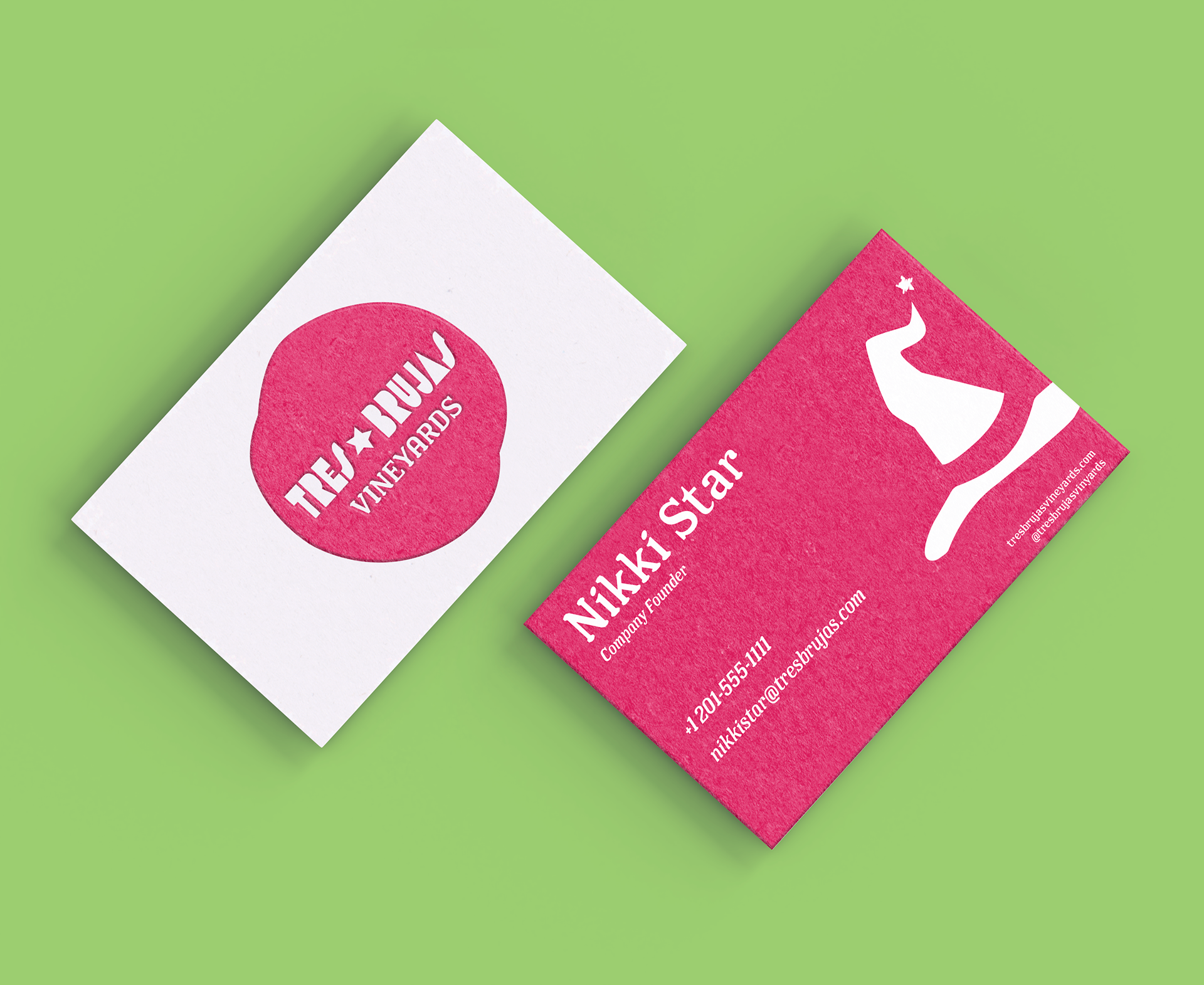
In addition to the packaging, I also designed a series of collateral materials to further establish the brand’s visual identity. These items include a business card, letterhead, and envelope, all thoughtfully crafted to reflect the same aesthetic values and cultural roots found in the wine packaging.
To reinforce the brand’s color story and create memorable, tactile touchpoints, I also created branded pencils featuring the brand’s color palette. These details help extend the identity across multiple platforms, ensuring a consistent and engaging presence both in print and in hand.
This collateral suite supports the overall brand strategy by combining function with visual cohesion, emphasizing professionalism, authenticity, and sustainability at every touchpoint.
Included here are my design files, presented in their flat layout form to show the full scope of the packaging design. You’ll notice that there are two duplicate panels on the front and back. This was a strategic design decision made with real-world retail environments in mind.
In many stores, products aren’t always stocked or displayed perfectly. By duplicating the main brand visuals on both sides, I ensured that no matter how the product is placed on the shelf, there’s a high likelihood the key brand elements will still be visible to the customer. This approach increases brand recognition and strengthens shelf presence—especially important in a competitive market.