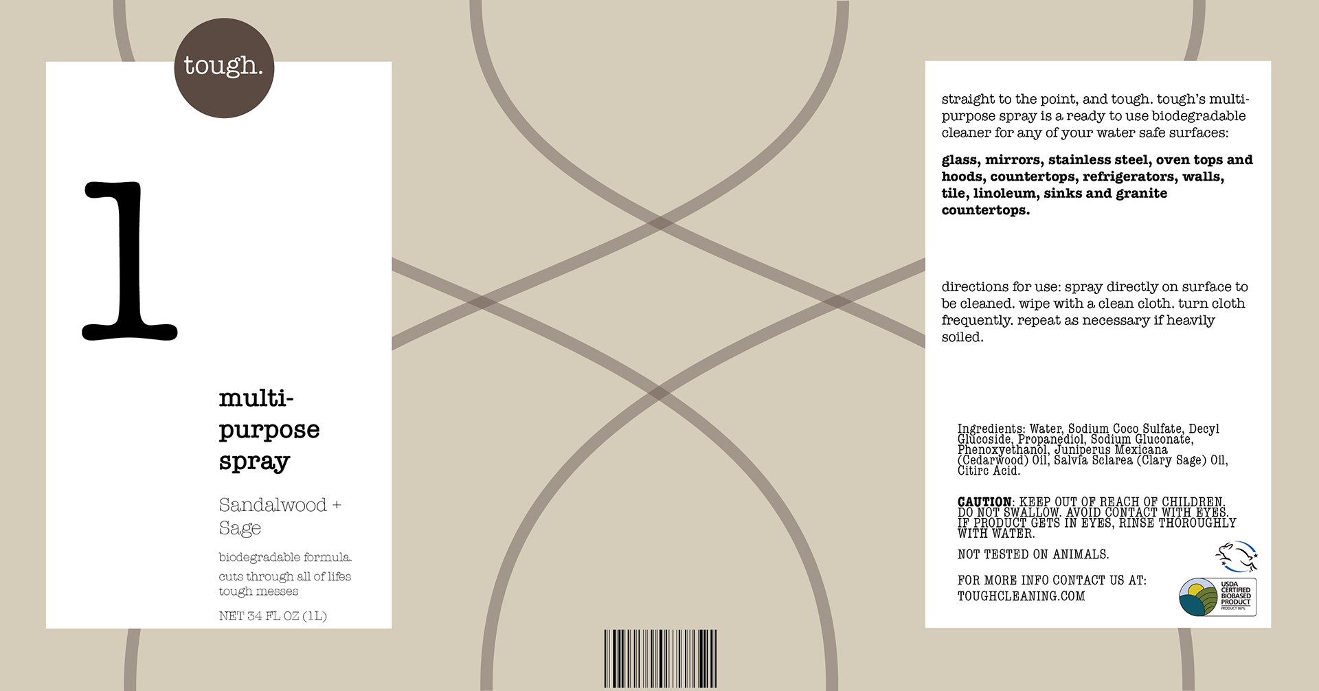
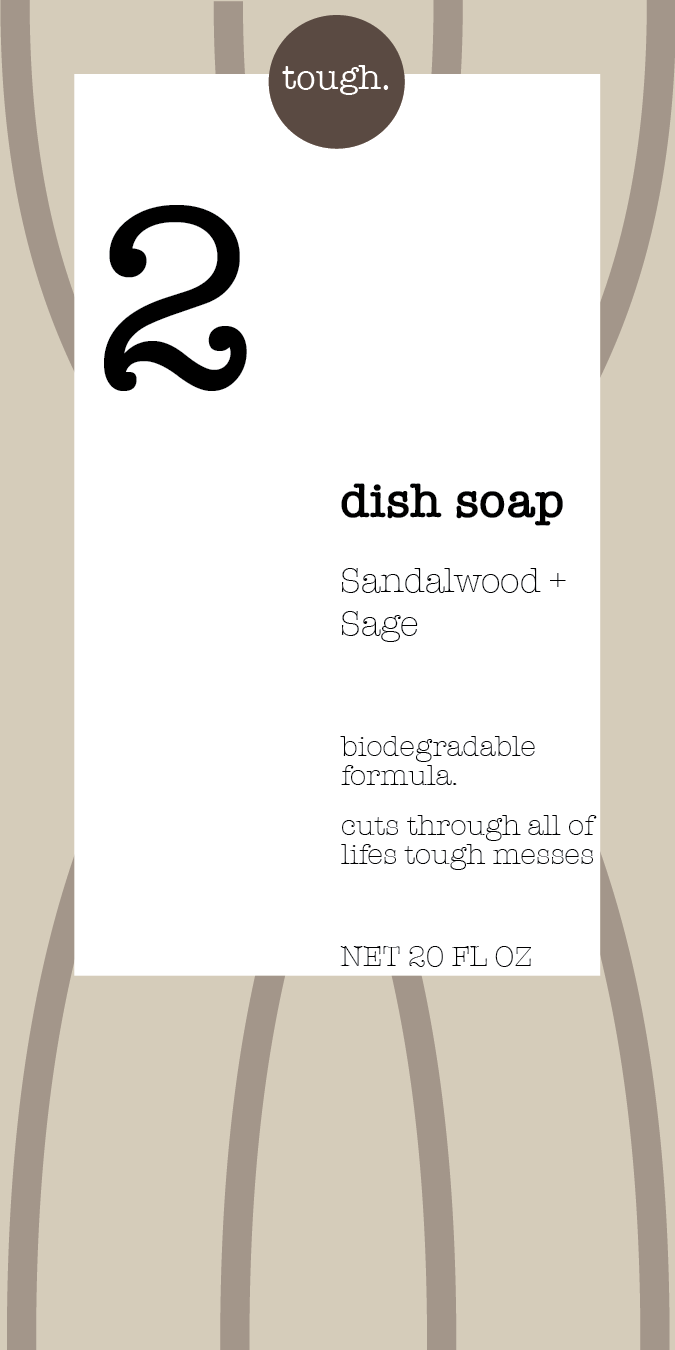
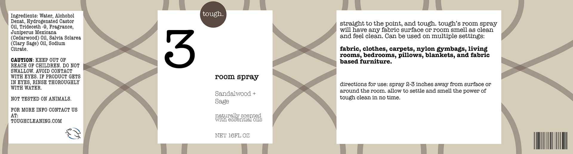
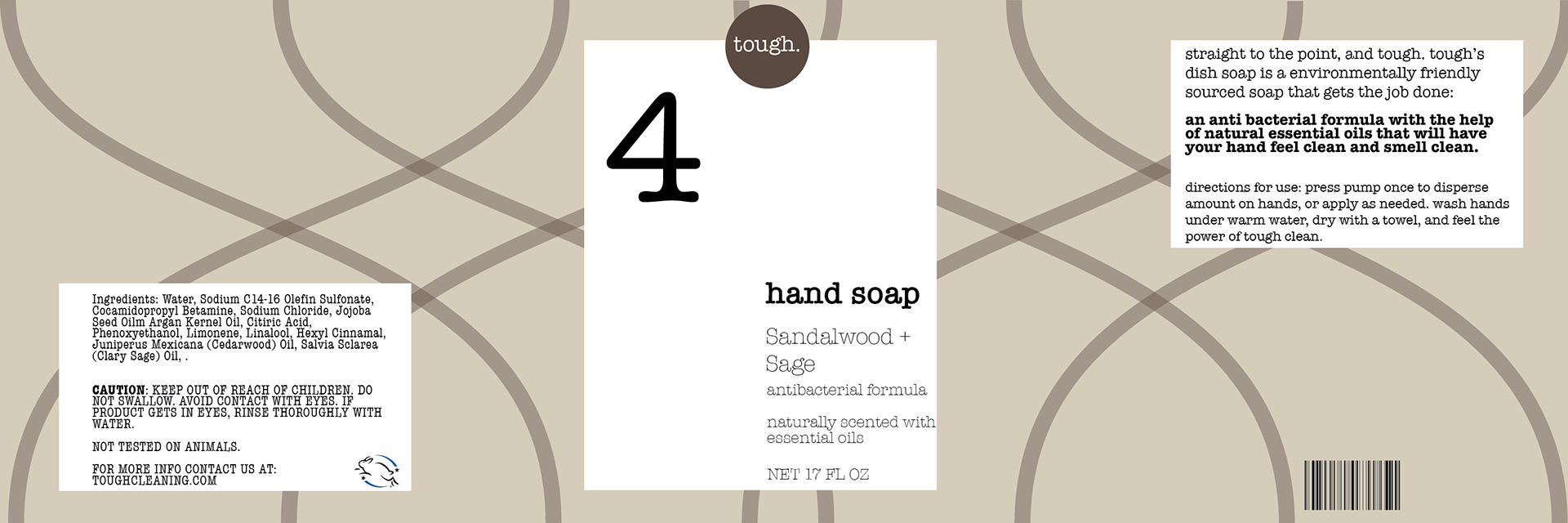
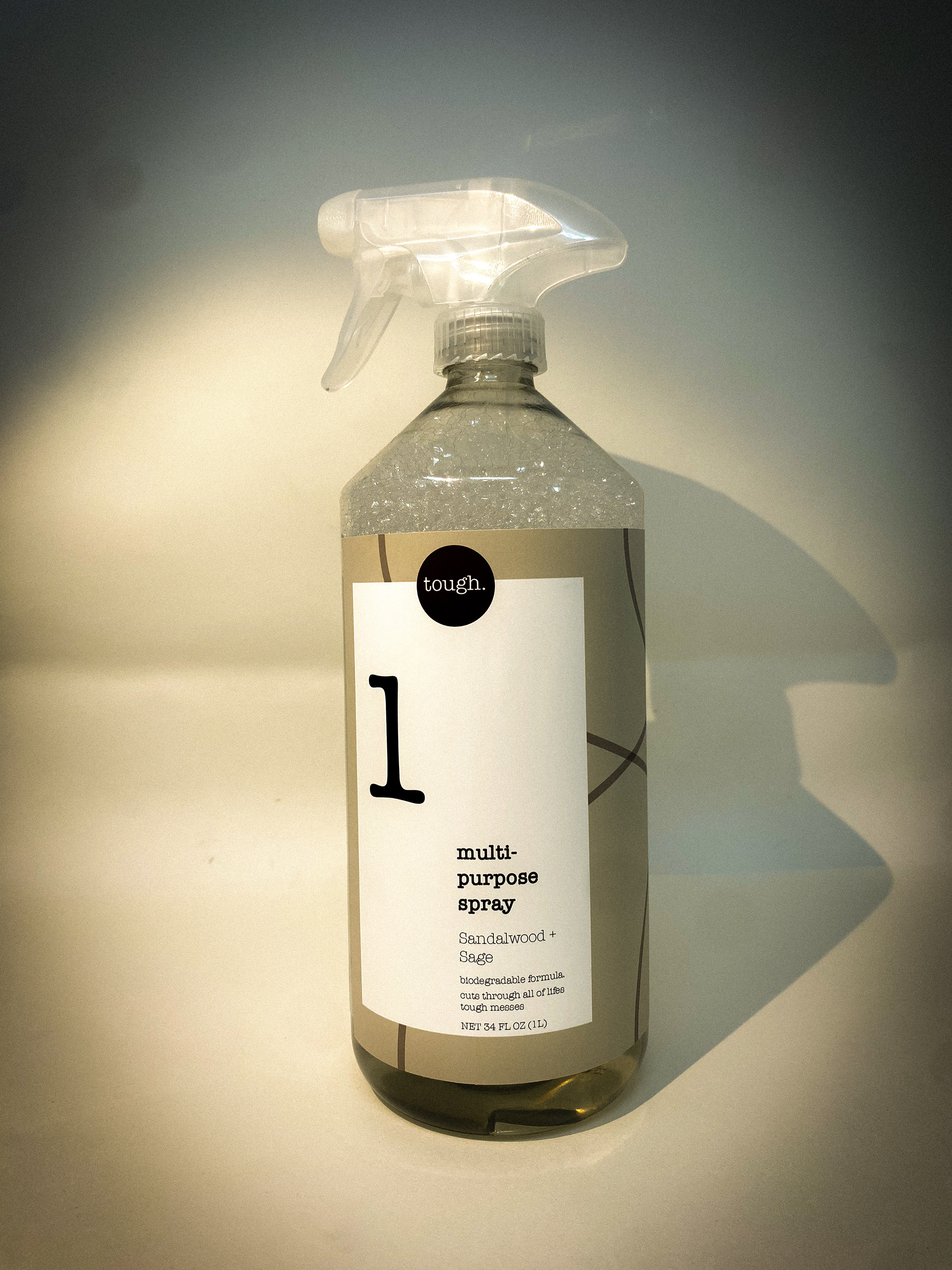
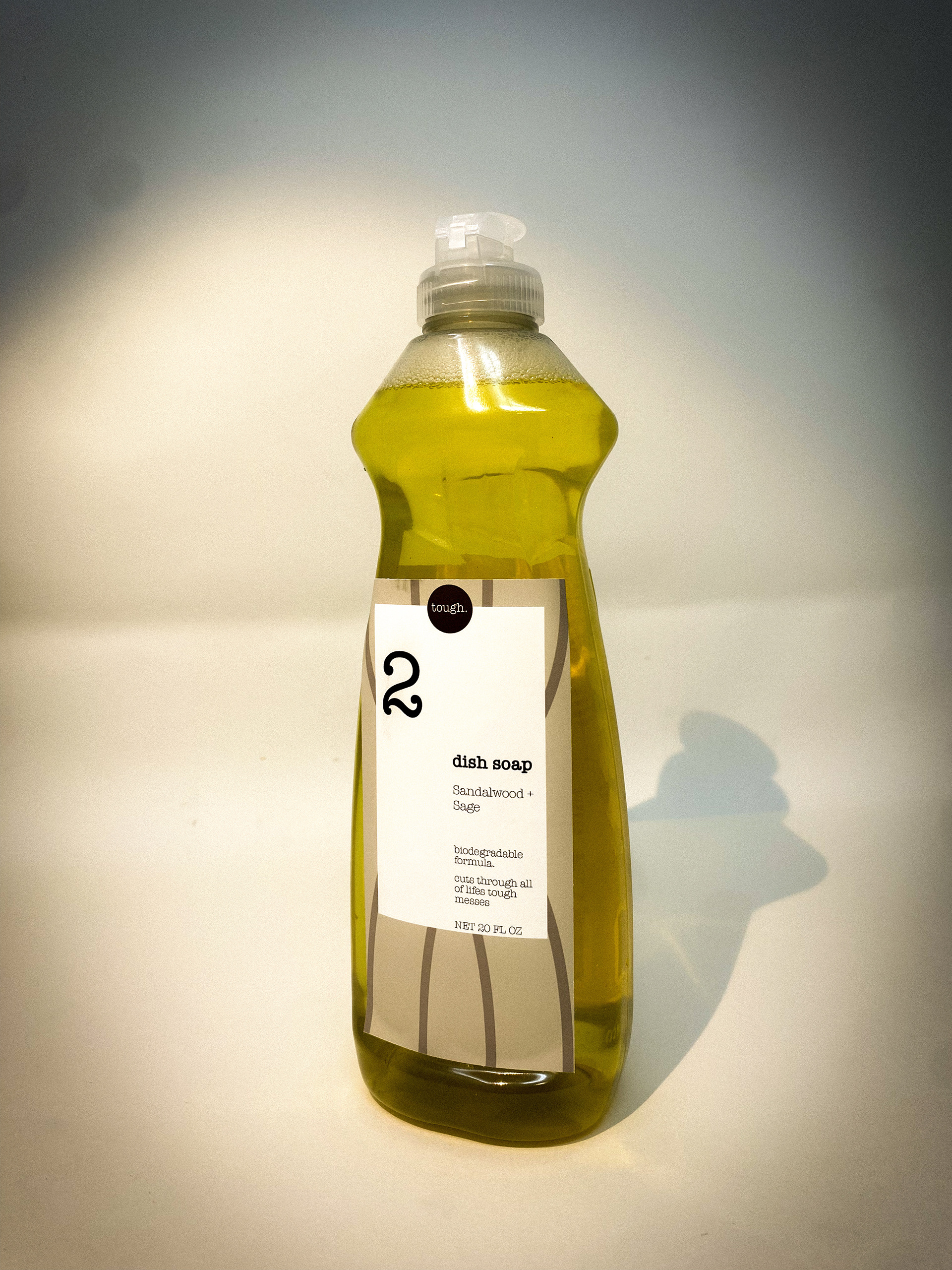
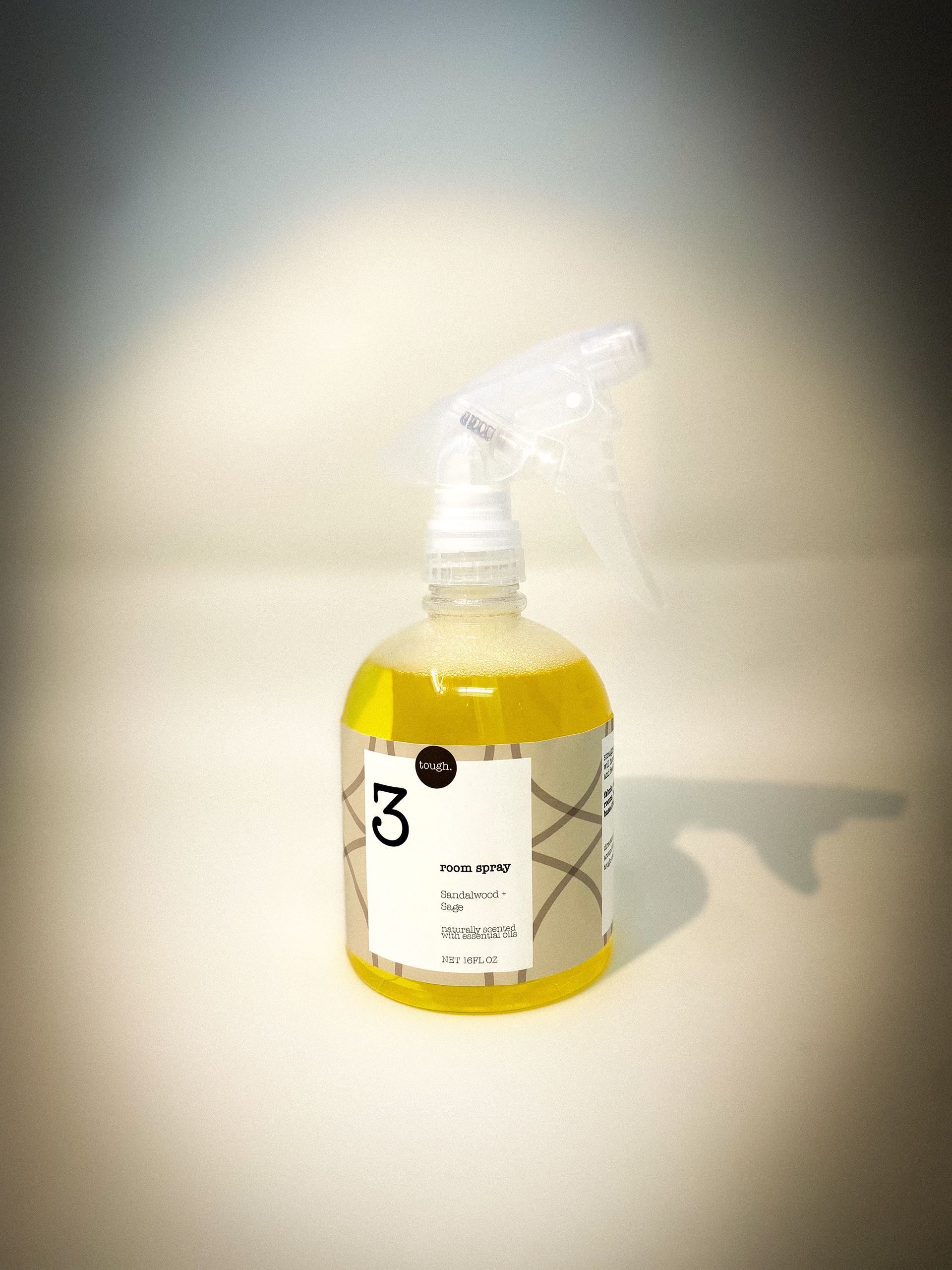
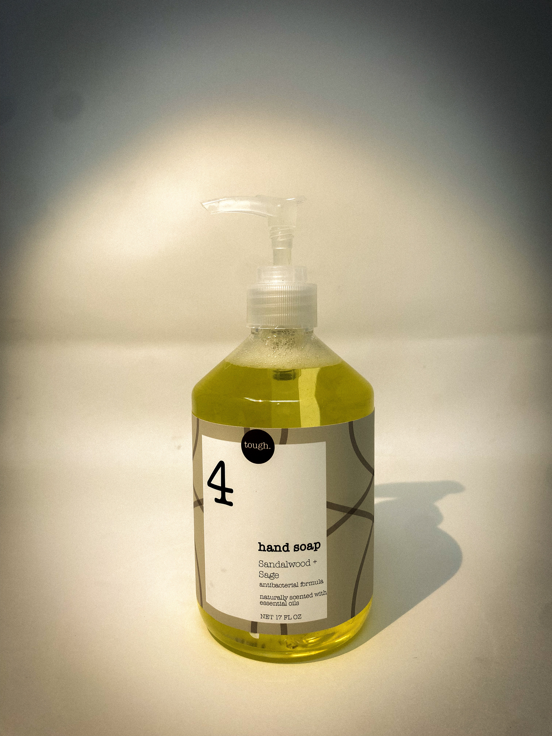
The goal of this project was to develop a cleaning brand specifically targeted toward the male market—a demographic often overlooked in traditional household product branding, which typically skews toward women.
To address this imbalance, I created a brand that embraces a masculine yet unpretentious aesthetic. The design features a muted, unisex color palette and a typewriter-inspired typeface for the logo, evoking a sense of simplicity, functionality, and understated luxury. These choices were intentionally made to appeal to male consumers who value cleanliness, minimalism, and modern design.
A key element of this brand is the custom-curated fragrance, designed to be unisex but subtly masculine—clean, refined, and far from overly perfumed. I also streamlined the product labeling and instructions, aligning with research that shows men tend to prefer clear, direct messaging in consumer products.
This project allowed me to explore how design can shift cultural norms and reframe everyday items to be more inclusive across gender identities—while still remaining stylish, functional, and brand-forward.
Throughout this project, I evolved my idea and definition of what masculinity is. At first glance, I imagine bold fonts, and colors such as red and blue. That seemed almost too safe and stereotypical to label a design “for men”. As I went further into my product research and target research, I came upon many Male Influencers that take part in Cleaning Rest Activities. When observing their spaces, I realized that this market is somewhat “feminine” with the way they upkeep themselves. That being said, taking care of your space shouldn’t necessarily be feminized. With these findings I developed a more unisex approach that still deemed to be masculine, inclusive, and aesthetically pleasing.