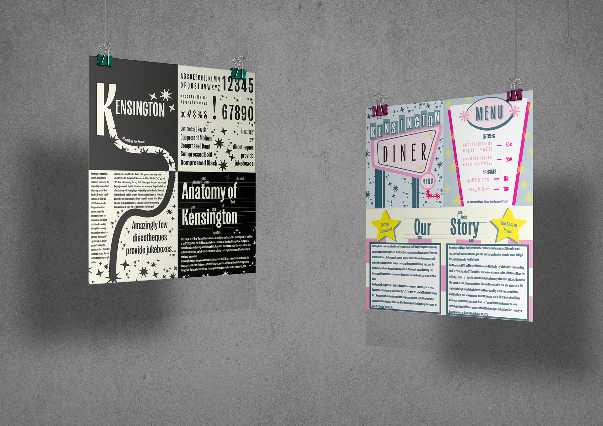
For this project, I was tasked with creating two distinct versions of a type specimen sheet. The process involved in-depth research into type foundries, analysis of existing specimen layouts, careful selection of a typeface, and gathering visual inspiration to guide my design choices.
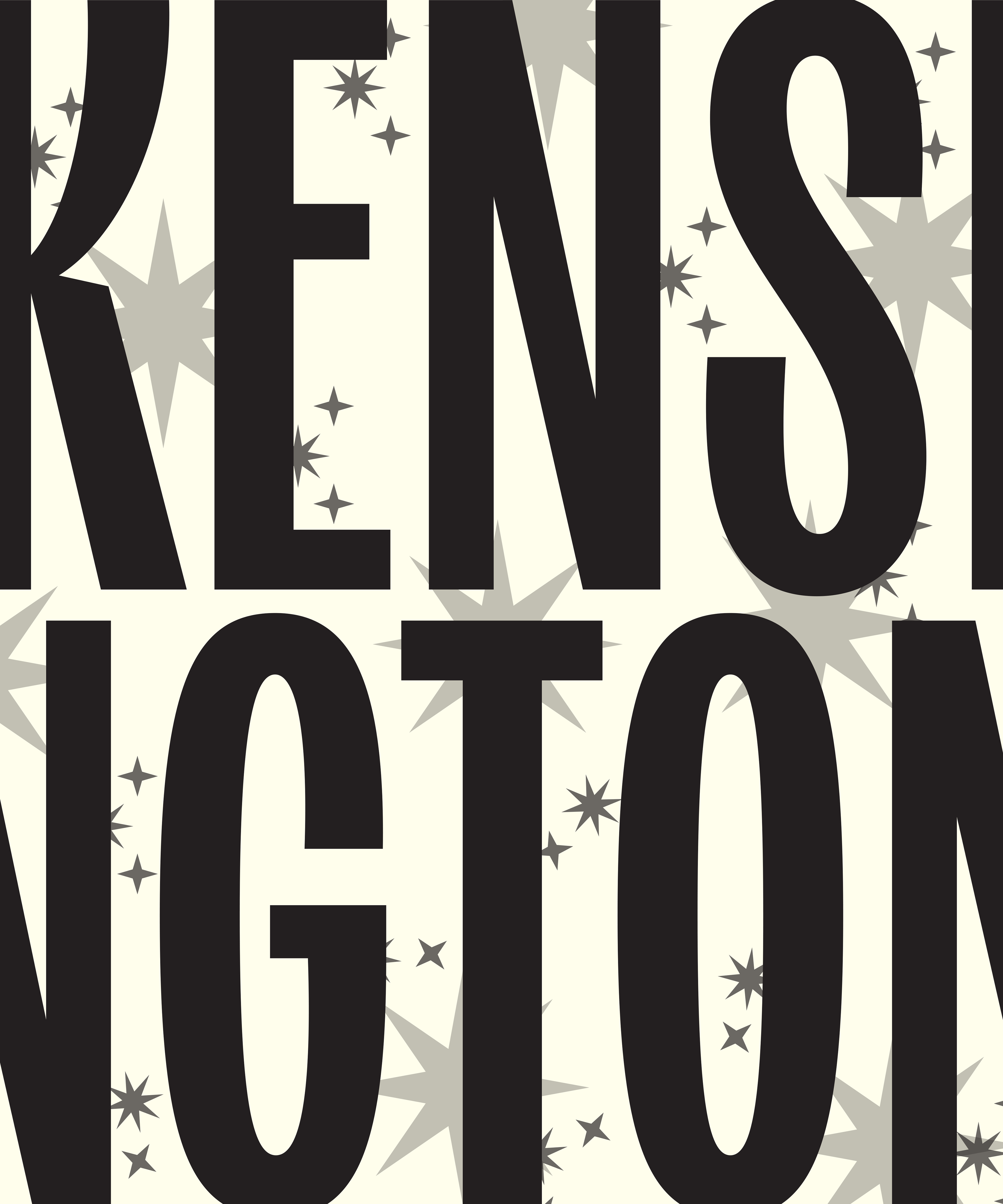
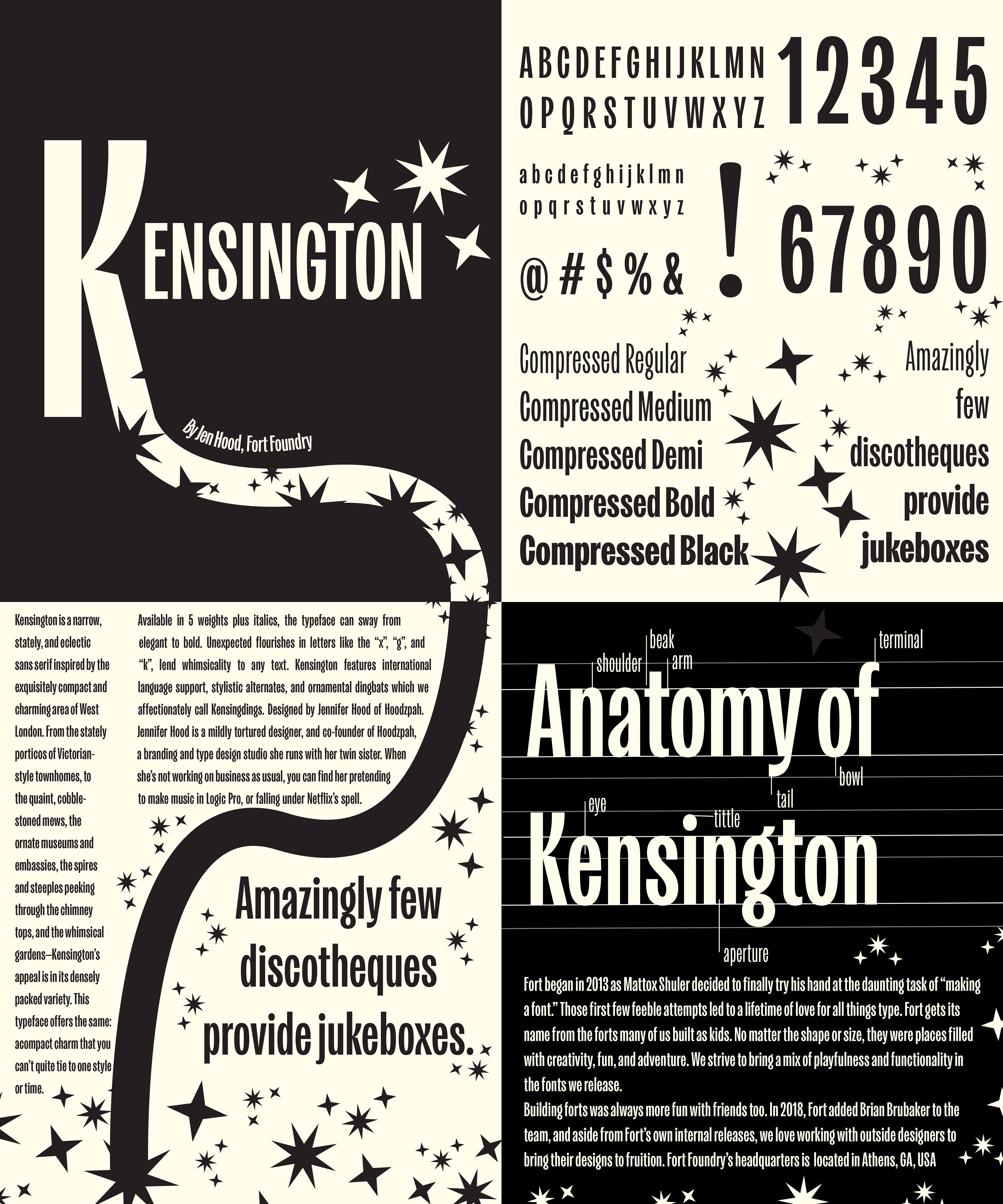
I chose "Kensington" by Fort Foundry, a typeface designed by Jen Hood. With its sleek, elongated letterforms, Kensington immediately struck me as having a distinctly retro flair. Its stylized geometry offered strong visual character and versatility, making it ideal for exploration in contrasting design contexts.
One version of my specimen sheet was purely typographic, focusing on showcasing the structure, weight variations, and glyphs of the typeface in a clean, functional layout. The second version embraced a more conceptual and thematic approach.
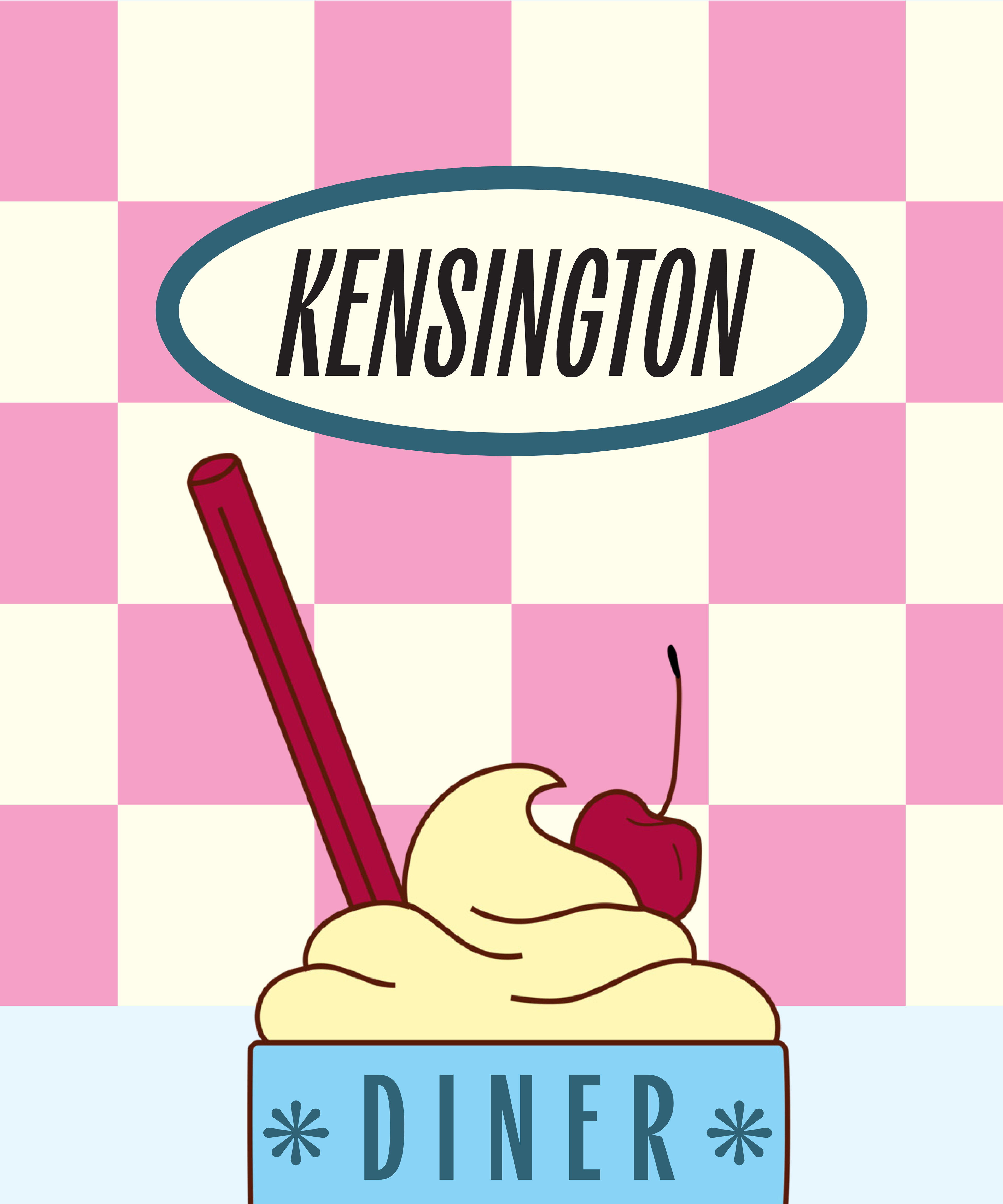
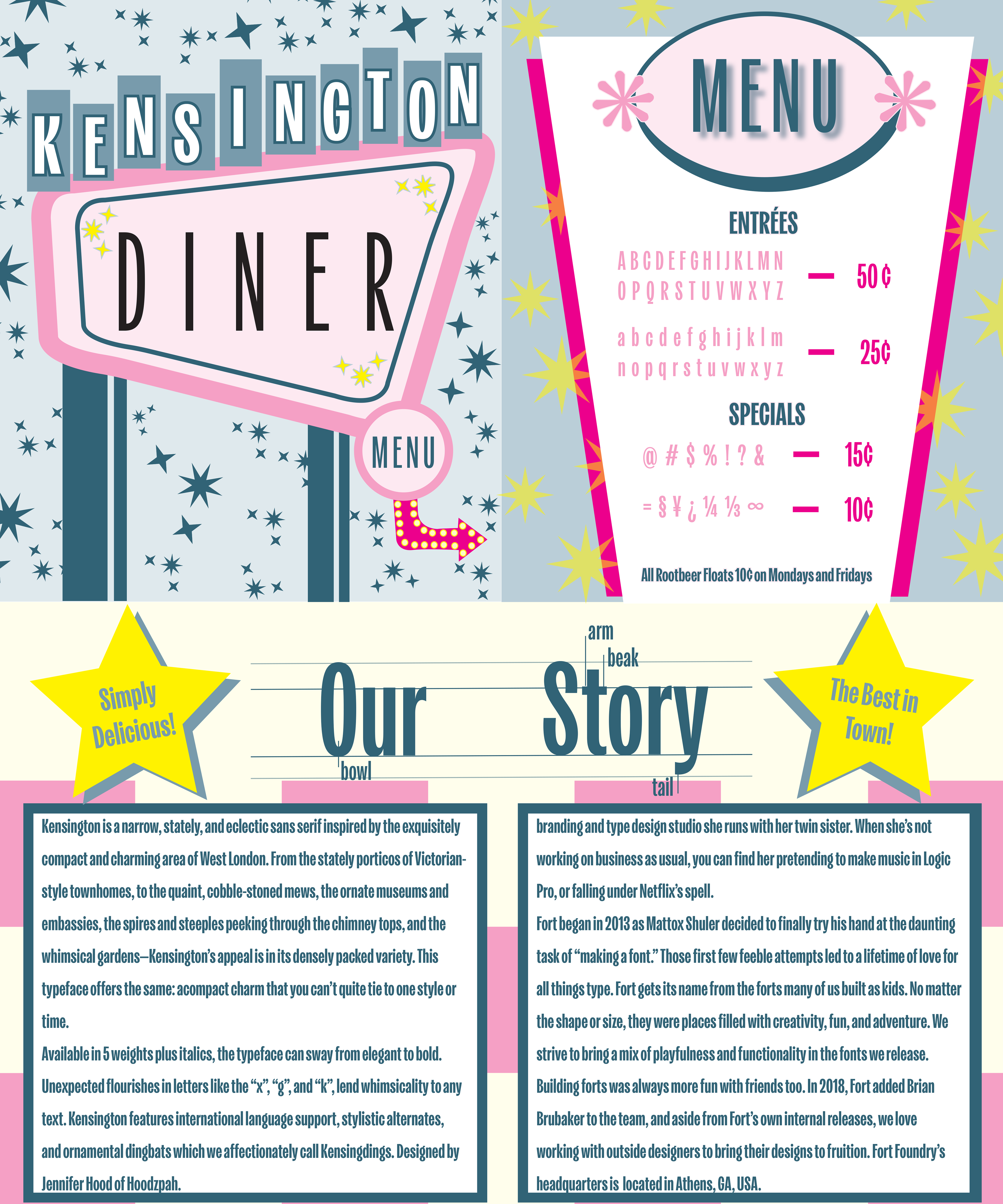
For this themed version, I drew inspiration from 1950s American diner culture, vintage Las Vegas signage, and classic diner menus—an aesthetic that perfectly complements Kensington’s nostalgic charm. Bright color palettes, bold compositions, and playful visual references brought the font to life in a spirited and evocative way.
Together, these two approaches highlight the flexibility of Kensington and demonstrate its potential across both utilitarian and expressive design applications.