As a tribute to the legacy of The New York Times and its iconic headline style, I was tasked with designing a custom front page that focused on "Good News"—a refreshing counterpoint to today’s often overwhelming headlines. The cover needed to reflect optimism while incorporating article content based on topics I’m personally passionate about.
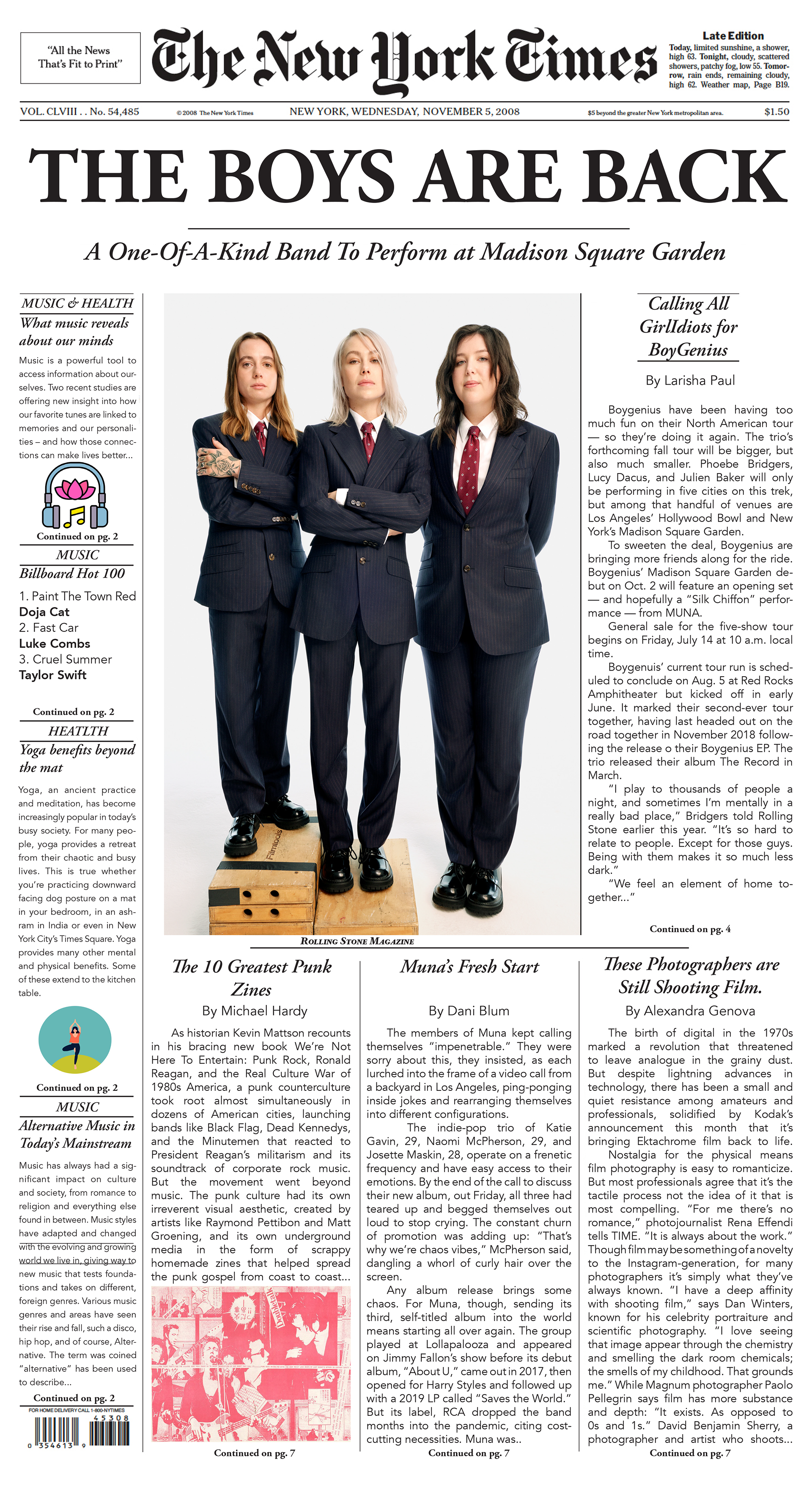
The first version of the design adhered to the formal structure of a traditional newspaper layout, with careful attention paid to typographic hierarchy, grids, and typesetting conventions. Every detail, from column width to pull quotes, was considered to echo the real-world mechanics of editorial design.
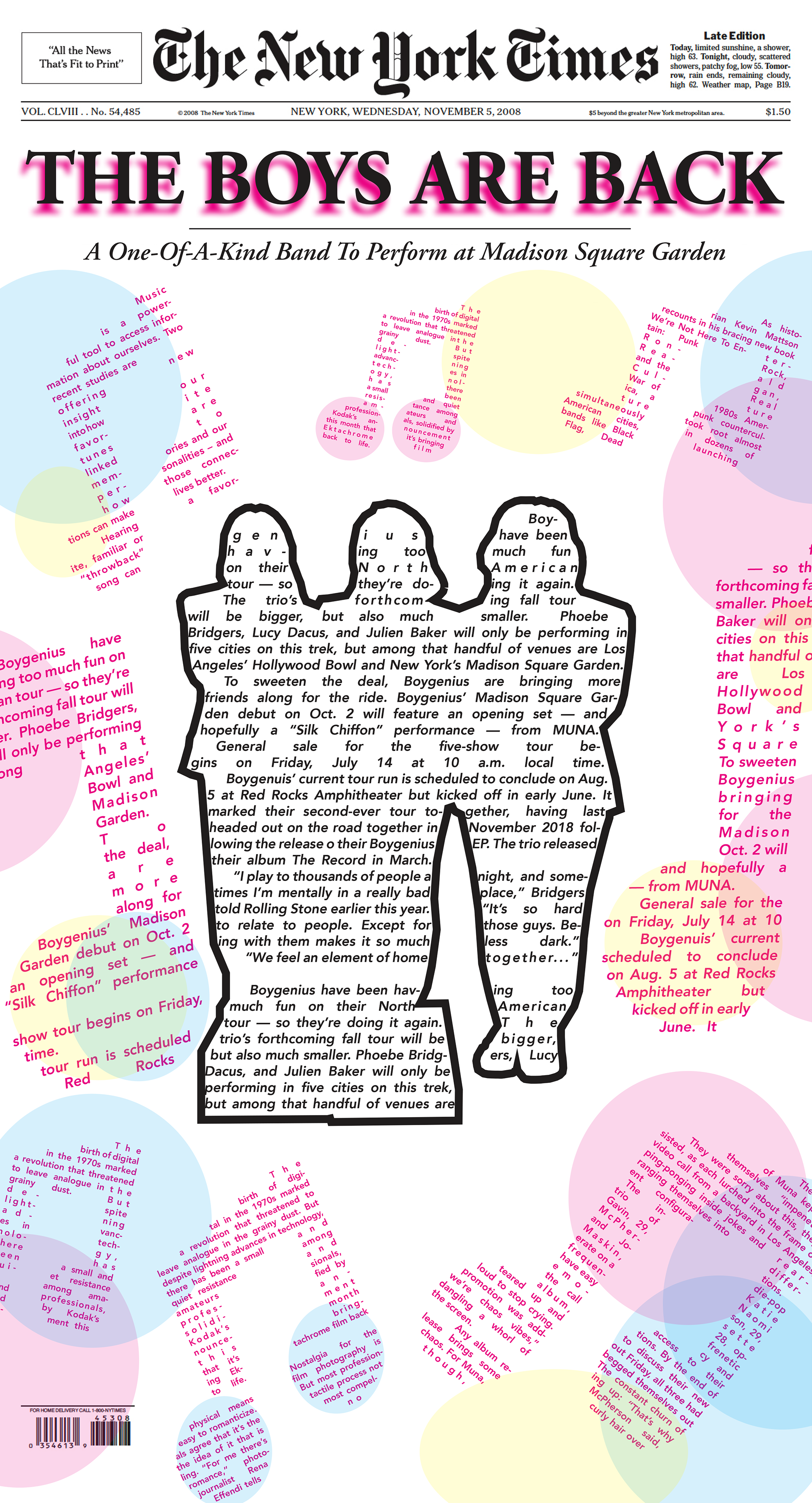
For the second iteration, I was challenged to push boundaries and create a more abstract and expressive typographic composition. This version reimagined the elements of the original cover—reinventing type, layout, and visual motifs to capture the emotional impact of the content in a less conventional, more artistic way.
This project deepened my understanding of typographic systems, visual storytelling, and the delicate balance between form and function in editorial design. It was both a technical and creative challenge—one that expanded my appreciation for the craft of news media and its evolving visual language.